Examples

Animated Plots

While a sophisticated animation API is planned for Bokeh, it is already possible to create animated plots just by updating a glyph’s data source periodically. This requires running bokeh-server so that plots are notified of the updates to the data. Below is a video capture of an animated plot in the ipython notebook (which may be found in examples/plotting/notebook).

../../_images/animated.gif

Note that all the tools, zoom, pan, resize function normally and the plot continues to animate while the tools are used. Currently in order to animate, you must grab the glyph renderer off a plot, update its data source, then store the data source on the session. The code to animate the above plot is shown here:

renderer = p.select(dict(type=GlyphRenderer))
ds = renderer[0].data_source

while True:

    rmin = ds.data["inner_radius"]
    rmin = roll(rmin, 1)
    ds.data["inner_radius"] = rmin

    rmax = ds.data["outer_radius"]
    rmax = roll(rmax, -1)
    ds.data["outer_radius"] = rmax

    cursession().store_objects(ds)
    time.sleep(.10)

Applets

It is possible to use Bokeh to create dashboard-like applets. These applets can be served directly from the Bokeh Server, or they may be embedded in you own web applications. In addition to the standard Bokeh interactive plot tools, Bokeh applets can contain widgets such as drop downs, date selectors, and sliders. The values are from these widgets are made available to the applet code, which can add, remove, or update plots or otherwise inform the application view based on user input.

One example is the stocks correlation applet pictured below:

../../_images/stocks_applet.png

This applet allows a user to pick between pairs of stocks to display correlation plots for. The subplots below show histograms for each time series as well as the time series themselves. These plots have linked panning and selections; making a selection on the correlation plot will highlight the selected points on the time series, as well as update the histograms to only show binnings got the selected points.

The code and instructions for running this example can be found at examples/app/stock_applet.

Another example is the sliders applet that presents several sliders to modify parameters of a sin function:

../../_images/sliders_applet.png

The code and instructions for running this example can be found at examples/app/sliders_applet.

Novel Plots

Bokeh is designed to allow you to flexibly compose many different glyph types into one plot. As an example, we will step through how to reproduce Will Burtin’s antibiotics chart, shown below, using Bokeh.

../../_images/burtin_novel.png

This first block defines the data and computes some derived quantities used in the plot using NumPy and Pandas:

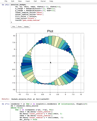
from collections import OrderedDict
from math import log, sqrt

import numpy as np
import pandas as pd
from six.moves import cStringIO as StringIO

from bokeh.plotting import *
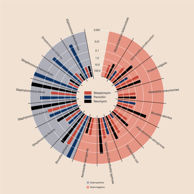
antibiotics = """
bacteria,                        penicillin, streptomycin, neomycin, gram
Mycobacterium tuberculosis,      800,        5,            2,        negative
Salmonella schottmuelleri,       10,         0.8,          0.09,     negative
Proteus vulgaris,                3,          0.1,          0.1,      negative
Klebsiella pneumoniae,           850,        1.2,          1,        negative
Brucella abortus,                1,          2,            0.02,     negative
Pseudomonas aeruginosa,          850,        2,            0.4,      negative
Escherichia coli,                100,        0.4,          0.1,      negative
Salmonella (Eberthella) typhosa, 1,          0.4,          0.008,    negative
Aerobacter aerogenes,            870,        1,            1.6,      negative
Brucella antracis,               0.001,      0.01,         0.007,    positive
Streptococcus fecalis,           1,          1,            0.1,      positive
Staphylococcus aureus,           0.03,       0.03,         0.001,    positive
Staphylococcus albus,            0.007,      0.1,          0.001,    positive
Streptococcus hemolyticus,       0.001,      14,           10,       positive
Streptococcus viridans,          0.005,      10,           40,       positive
Diplococcus pneumoniae,          0.005,      11,           10,       positive
"""

drug_color = OrderedDict([
    ("Penicillin",   "#0d3362"),
    ("Streptomycin", "#c64737"),
    ("Neomycin",     "black"  ),
])

gram_color = {
    "positive" : "#aeaeb8",
    "negative" : "#e69584",
}

df = pd.read_csv(StringIO(antibiotics), skiprows=1, skipinitialspace=True)

width = 800
height = 800
inner_radius = 90
outer_radius = 300 - 10

minr = sqrt(log(.001 * 1E4))
maxr = sqrt(log(1000 * 1E4))
a = (outer_radius - inner_radius) / (minr - maxr)
b = inner_radius - a * maxr

def rad(mic):
    return a * np.sqrt(np.log(mic * 1E4)) + b

big_angle = 2.0 * np.pi / (len(df) + 1)
small_angle = big_angle / 7

x = np.zeros(len(df))
y = np.zeros(len(df))

Configure Bokeh to generate static HTML output using output_file:

output_file("burtin.html", title="burtin.py example")

We are going to be combining several glyph renderers on to one plot, so let define a figure:

p = figure(plot_width=width, plot_height=height, title="",
    x_axis_type=None, y_axis_type=None,
    x_range=[-420, 420], y_range=[-420, 420],
    min_border=0, outline_line_color=None,
    background_fill="#f0e1d2", border_fill="#f0e1d2")

Next we add the first glyph:

p.line(x+1, y+1, alpha=0)

then the red and blue regions using annular_wedge:

# annular wedges
angles = np.pi/2 - big_angle/2 - df.index.to_series()*big_angle
colors = [gram_color[gram] for gram in df.gram]
p.annular_wedge(
    x, y, inner_radius, outer_radius, -big_angle+angles, angles, color=colors,
)

finally some others small wedges representing the antibiotic effectiveness and the radial axes:

# small wedges
p.annular_wedge(x, y, inner_radius, rad(df.penicillin),
    -big_angle+angles+5*small_angle, -big_angle+angles+6*small_angle,
    color=drug_color['Penicillin'])
p.annular_wedge(x, y, inner_radius, rad(df.streptomycin),
    -big_angle+angles+3*small_angle, -big_angle+angles+4*small_angle,
    color=drug_color['Streptomycin'])
p.annular_wedge(x, y, inner_radius, rad(df.neomycin),
    -big_angle+angles+1*small_angle, -big_angle+angles+2*small_angle,
    color=drug_color['Neomycin'])

# radial axes
p.annular_wedge(x, y, inner_radius-10, outer_radius+10,
    -big_angle+angles, -big_angle+angles, color="black")

Then we add some text labels for the bacteria using text:

# bacteria labels
xr = radii[0]*np.cos(np.array(-big_angle/2 + angles))
yr = radii[0]*np.sin(np.array(-big_angle/2 + angles))
label_angle=np.array(-big_angle/2+angles)
label_angle[label_angle < -np.pi/2] += np.pi # easier to read labels on the left side
p.text(xr, yr, df.bacteria, angle=label_angle,
    text_font_size="9pt", text_align="center", text_baseline="middle")

some legends using circle, text, and rect:

# OK, these hand drawn legends are pretty clunky, will be improved in future release
p.circle([-40, -40], [-370, -390], color=list(gram_color.values()), radius=5)
p.text([-30, -30], [-370, -390], text=["Gram-" + gr for gr in gram_color.keys()],
    text_font_size="7pt", text_align="left", text_baseline="middle")

p.rect([-40, -40, -40], [18, 0, -18], width=30, height=13,
    color=list(drug_color.values()))
p.text([-15, -15, -15], [18, 0, -18], text=list(drug_color.keys()),
    text_font_size="9pt", text_align="left", text_baseline="middle")

and we get rid of the grid lines:

p.xgrid.grid_line_color = None
p.ygrid.grid_line_color = None

Finally, show the plot:

show(p)